The Difference Between UX and UI and Why It Means Everything
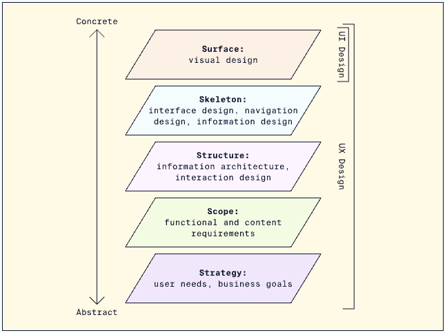
Image: Five layers of UX Design
A recurring theme in my work involves emphasizing the significance of establishing a shared vocabulary within product teams. One of the fundamental yet frequently overlooked distinctions is the clarity surrounding UX (User Experience) and UI (User Interface), how they interrelate, and how to effectively attain them.
The importance of alignment and clarity regarding UX and UI is profound when we think of the value of a product team’s contributions being summed up by their ability to execute 2 important steps: Discovery and delivery. The ‘discovery’ aspect encompasses understanding user desires related to their interaction with our products, constituting UX. Conversely, the ‘delivery’ part pertains to UI, determining the appearance of the product's interface. Enhancing user experiences (UX) involves delivering improved interactions through the user interface (UI). Essentially, the user experience (UX) encapsulates the entirety of a user's encounter with our product. It's tied to the emotions elicited during interactions and the ease with which users achieve their objectives. The user interface (UI), on the other hand, entails the visual elements such as buttons, inputs, indicators, and colors that collectively form the holistic user experience.
To draw an analogy to driving a car, a positive driving experience involves well-maintained roads, scenic surroundings, clear navigational cues, and appropriate signals for stopping and accelerating. It entails the holistic experience and the feelings that are triggered from a good driving experience. The UI in this analogy corresponds to the road surface, road markings, traffic signs, and visual prompts that guide the driving experience. It's crucial to recognize that solid UI hinges on a solid UX foundation. A beautiful array of traffic signs and signals wouldn't matter if they were placed on the wrong side of the road. Effective UI is built upon a coherent and robust UX. Dare I say, there is no such thing as great UI without first a great UX.
Throughout my experience in various product teams, a common and detrimental issue of misalignment frequently stems from the team's collective understanding, or lack thereof, of these seemingly fundamental concepts of UX and UI. For non-designers, the solution might appear straightforward – updating buttons, inputs, and colors with a contemporary flair – and everything will magically improve. However, for seasoned designers, the new UI and color scheme are irrelevant if the user's journey is plagued with error messages and dead ends. If clicking a button results in something entirely unexpected, the button's color becomes trivial for the designer.
Consider the long-term consequences of a product team that by default overly focuses on UI, presuming that enhancing aesthetics will resolve most issues. This approach fosters a reactive stance toward product development, diverting attention away from the core necessity – comprehending user needs and goals. Products developed through this UI-centric lens typically exhibit inconsistencies, error messages, and flow interruptions. Such organizations perpetually play catch-up, patching up issues rather than preventing them. This prioritization of aesthetics over functionality has dire repercussions for both the business and its users. For UX to be properly and continuously addressed requires design thinking methodologies to be at the heart of all product initiatives while consistently leveraging business goals.
My belief is that this critical issue arises when product leadership teams lack members with a background in design and/or research. Individuals without design expertise often struggle to discern the underlying UX problems beneath what they observe in the product. Their attempts to address these issues involve arbitrary changes to the UI, hoping to catch lightning in a bottle rather than systematically addressing the root causes of user dissatisfaction.
To clarify, there are situations where we must quickly develop highly polished prototypes and interfaces for marketing or other presentation purposes with little time for UX considerations, especially in the fast-paced environment of a startup. While this is commonplace and acceptable, it's essential to categorize and treat these initiatives separately from actual features that real users will engage with. When these initiatives get mixed up with genuine product features, teams become disoriented, processes weaken, and the strategic mechanisms used by executives to guide the product team towards profitability start to erode. If left unchecked, these negative consequences can escalate exponentially.
In truth, the UI aspect is the more straightforward facet of the design process. Myriads of design systems, color palettes, and icon libraries are readily available and can be integrated into a product in mere hours. The real challenge, and where seasoned designers excel, lies in synergizing user needs and business objectives within engineering constraints, constructing a cohesive UX framework that leads to customer satisfaction and profitability. This requires adept utilization of design thinking methodologies. Only after finalizing the UX can the UI layer properly be added to the product, yielding exceptional user experience outcomes.
